


A business owner usually notices the problem before they can name it. Traffic looks decent. People are visiting key pages. Maybe a few forms come through, but not enough to justify the time or money going into the site. If you have been asking, why is my business website not converting, the answer is rarely just one thing. More often, it is a chain of small issues that create hesitation, confusion, or friction at the exact moment a visitor should be taking action.
For small and midsize businesses, that matters because your website is not just a digital brochure. It is part of your sales process, your customer service process, and often your first impression. When it underperforms, the effect shows up in missed leads, slower growth, and more pressure on your team to compensate manually.
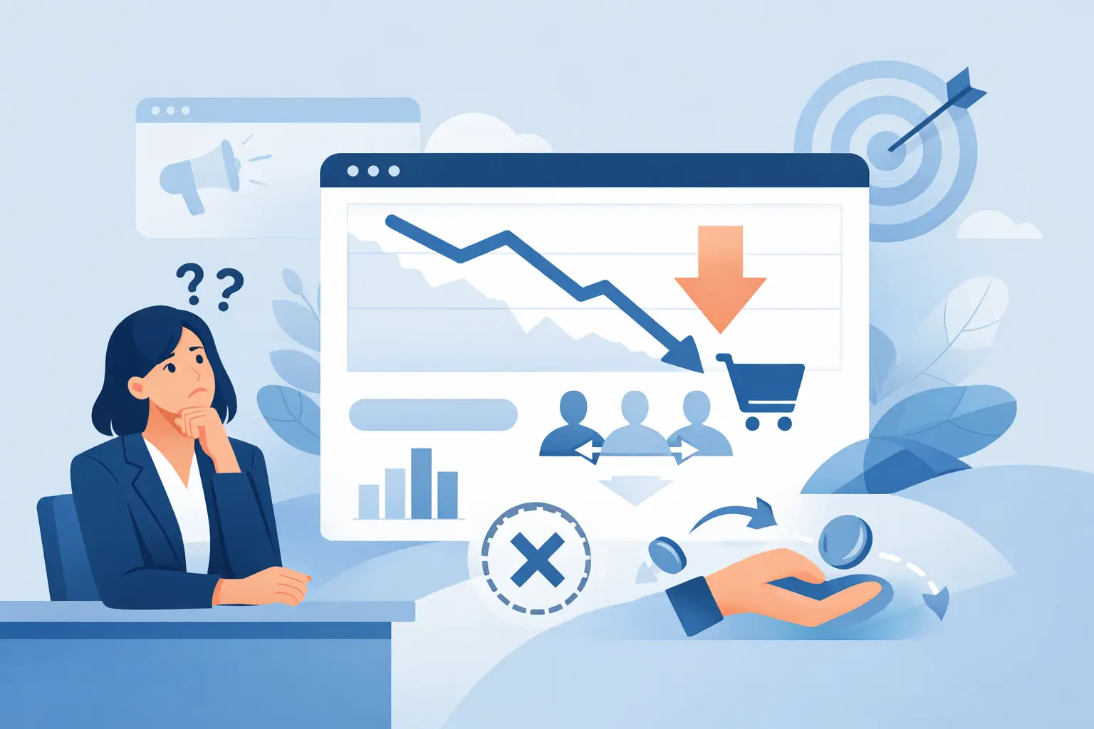
Why is my business website not converting even with traffic?
A site can attract visitors and still fail to produce calls, form submissions, bookings, or purchases. Traffic tells you people are arriving. Conversion tells you whether the site is doing its job.
In many cases, businesses invest in getting people to the website before they fix what happens after the click. That creates a common pattern: paid ads, search traffic, or referrals bring in attention, but the website does not make the next step easy or convincing enough. The problem is not visibility alone. It is what the visitor sees, understands, and experiences once they land.
The most common issue is a mismatch between user intent and page content. If someone visits your site looking for a service, they want quick proof that you offer it, that you are credible, and that contacting you will be straightforward. If they instead land on vague messaging, outdated visuals, or a page that buries the next step, they leave.
Your message may be too broad
Many business websites try to sound polished and end up sounding generic. Visitors do not convert because they cannot immediately tell what the company does, who it helps, or why it is the right fit.
This is especially common on homepages. A headline might say something like “solutions for modern business” or “helping companies grow through technology.” That sounds fine in a meeting, but on a website it forces the visitor to do extra work. They should not have to interpret your value. They should see it within seconds.
Clear messaging is usually specific messaging. If you provide managed IT support, website development, app workflows, or business technology help, say that plainly. If you serve small and midsize businesses that need one reliable team instead of multiple vendors, say that too. Good conversion often starts with reducing uncertainty.
The site may look fine but still create friction
A website does not need to be flashy to convert well. It does need to be usable. That is where many businesses lose leads.
Friction shows up in small ways. The contact button is hard to find. The form asks for too much information too early. The mobile version is awkward. The phone number is not clickable. The page loads slowly. None of these issues sounds dramatic on its own, but together they create drop-off.
A practical business website should make action feel easy. If a visitor wants to call, they should find the number immediately. If they want a quote, the form should be simple. If they are comparing providers, they should be able to scan services, process, and proof without hunting through the site.
There is a trade-off here. Some businesses want to collect more information upfront to qualify leads. That can help sales, but only if demand is already strong and your audience is highly motivated. For many local service businesses, reducing form friction leads to better overall conversion.
Why is my business website not converting on mobile?
Because mobile visitors are less patient, less forgiving, and often closer to taking immediate action.
A desktop site that looks acceptable can still perform poorly on phones. Text may be too dense, buttons too small, images too large, or forms too cumbersome. Navigation can also become a problem fast. If someone has to pinch, scroll excessively, or open multiple menus just to find your services or contact information, you are introducing unnecessary resistance.
Mobile users often have high intent. They may be looking for help now, comparing vendors during a break, or checking whether your business looks credible enough to contact. If your mobile experience feels outdated or inconvenient, they may not complain. They simply move on.
Reviewing your site from a customer perspective helps. Open it on your own phone and try to complete the main action you want a prospect to take. If that process feels slower than it should, that is likely affecting your results.
Trust signals may be too weak
People do business with companies that feel credible and dependable. If your website does not build that confidence, visitors hesitate.
Trust is built through a combination of visual quality, clarity, and evidence. An outdated design can signal neglect even if your business is excellent. Thin service pages can make your company look smaller or less established than it is. Missing testimonials, weak project examples, or no visible local presence can also hurt conversion.
This does not mean every site needs dozens of reviews and a large case study library. It does mean visitors need enough proof to feel comfortable taking the next step. That could include client feedback, examples of completed work, a clear service area, team information, or a straightforward explanation of how your process works.
For Utah businesses in particular, local trust matters. Prospects often want to know they are dealing with a responsive team that understands how local operations work and can actually support them when something needs attention.
Your calls to action may be unclear
A surprising number of websites do not clearly ask the visitor to do anything.
Sometimes the issue is literal. There is no strong call to action on the page, or the same generic button appears everywhere without context. Other times the issue is strategic. The site asks for too much commitment too soon, such as pushing a full consultation before the visitor has enough confidence to request one.
The right call to action depends on the page and the audience. A homepage might invite someone to request support, schedule a conversation, or ask for a quote. A service page may work better with a more specific next step tied to that service. The key is clarity. If the visitor has to decide what they are supposed to do next, conversion usually drops.
The content may answer too little or too much
Good website content helps people make decisions. Poor website content either leaves too many questions unanswered or overwhelms the visitor with details that do not help them move forward.
If your content is too thin, visitors may not understand your capabilities, pricing approach, timeline, or service fit. If it is too heavy, they may lose the main point before they get to the call to action.
This is where practical structure matters. Keep pages focused on what the customer needs to know to feel informed and comfortable. What do you offer? Who is it for? What problems does it solve? What happens next? Why should someone trust you? That is usually enough to support action without creating clutter.
Your website may not match your real sales process
Some websites underperform because they were built around aesthetics, not operations.
If your business wins customers through responsiveness, practical support, and clear follow-through, the website should reflect that experience. If your actual process is personal and fast, but the website feels formal, vague, or slow, visitors get the wrong impression.
This disconnect is common when different vendors handle branding, web design, content, and technical support without a shared business goal. The result is a site that looks finished but does not function as part of the broader customer journey.
That is why conversion work is often less about redesigning everything and more about aligning the website with how your business actually earns trust and closes work.
What to fix first if your website is not converting
Start with the basics that affect decision-making fastest. Clarify your homepage message so a visitor immediately understands what you do and who you help. Simplify your navigation and contact paths. Tighten your forms. Make sure mobile use feels easy. Strengthen trust with real proof, not filler copy.
Then review your key service pages. Each one should make a clear case for the service, address likely questions, and offer a direct next step. If traffic is landing there and not converting, those pages deserve attention before you spend more on marketing.
It also helps to look at website performance through a business lens, not just a design lens. Are visitors seeing the right pages? Are those pages built to support actual inquiries? Is the site helping your team by attracting more qualified leads, or creating more back-and-forth because information is missing?
For many companies, the best improvements are not dramatic. They are practical adjustments that remove friction and make the site easier to trust, easier to use, and easier to act on. That kind of work tends to produce better leads and fewer missed opportunities.
If you have been wondering why is my business website not converting, the good news is that this problem is usually fixable. A website does not need to be complicated to perform well. It needs to be clear, credible, and aligned with how your business actually serves customers. When those pieces work together, the site stops being a placeholder and starts doing real work for your business.