









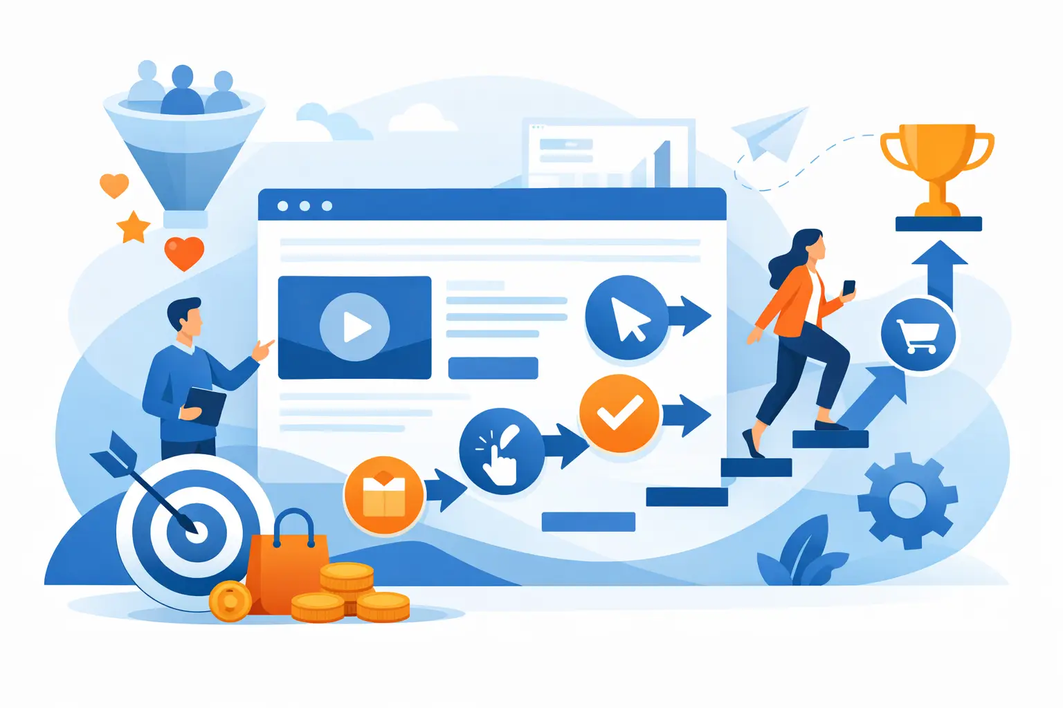
A website can look professional and still fail to produce calls, form submissions, or quote requests. The issue is often not traffic. It is the path visitors must take after they arrive. Knowing how to improve website conversion paths means removing uncertainty, shortening unnecessary steps, and making the next action obvious for the customer.
For a small or midsize business, this work is practical. A better conversion path can mean more booked appointments, qualified leads, service calls, or online purchases without increasing ad spend. It also gives your team fewer incomplete inquiries to chase and a clearer view of what your website is contributing to the business.
Start With the Action That Matters Most
A conversion path is the route a visitor follows from an entry page to a valuable action. That action might be requesting an estimate, scheduling service, calling the office, starting a trial, or submitting a project inquiry. Websites often underperform because they treat every action as equally important.
Choose one primary conversion for each major page. A plumbing service page may focus on scheduling service. A commercial contractor page may focus on requesting a consultation. A software company’s product page may focus on booking a demo. Supporting actions can still exist, but they should not compete with the main goal.
This is especially important on the home page. If visitors see “Contact Us,” “Learn More,” “Subscribe,” “View Services,” “Apply Now,” and “Get a Quote” all at the same visual level, they must decide what the business wants them to do. Many will postpone the decision and leave.
Use direct calls to action that describe the outcome. “Request Your Free Estimate” is clearer than “Submit.” “Schedule IT Support” tells a visitor more than “Get Started.” The wording should match the customer’s stage of decision-making. Asking a first-time visitor to “Buy Now” may be reasonable for a simple product, but it can be too aggressive for a high-value service that requires trust and discussion.
Map How Visitors Actually Move Through the Site
Improving website conversion paths begins with observation, not assumptions. Review the pages that receive the most traffic and identify what visitors can do next from each one. Then follow those paths yourself on a desktop, a phone, and a slower connection.
Look for points where the journey becomes unclear. A visitor may land on a service page from a search result, read enough to become interested, and then find no visible way to request help without returning to the home page. Another visitor may click a call to action only to reach a generic contact page that asks questions unrelated to the service they were viewing.
A useful path has continuity. If someone is reading about managed IT support, the next step should lead to an IT support inquiry, a service consultation, or a direct phone call. It should not force them to sort through unrelated services again.
Match the Landing Page to the Source
Visitors arrive with different levels of intent. Someone who searches for “emergency computer support” wants fast reassurance, phone access, and a simple way to explain the issue. Someone researching a new business website needs proof of process, relevant capabilities, and a low-pressure way to discuss a project.
Paid ads, email campaigns, social posts, and local search listings should lead to pages that continue the message they clicked. Sending all traffic to a general home page may be easier to manage, but it usually creates extra work for the visitor. A focused landing page can improve lead quality because it sets expectations before a prospect contacts you.
Reduce Friction in Forms and Contact Steps
Every field in a form is a small request for effort. If a prospect only wants to ask a question, a long form that requires budget, company size, detailed project scope, and several dropdowns can stop the conversation before it starts.
Ask only for information your team needs to respond appropriately. For many service inquiries, a name, preferred contact method, basic message, and perhaps a company name are enough. You can gather detailed requirements after making contact.
The same principle applies to booking tools and customer portals. Keep account creation, scheduling, and checkout steps proportional to the value of the transaction. A customer buying a low-cost item should not have to complete a lengthy intake process. On the other hand, a complex B2B service request may benefit from a few qualifying questions because they help both sides prepare for a productive conversation.
Form errors should be clear and specific. Do not erase entered information when a visitor misses a required field. Confirm what happens after submission, too. A plain “Thank you” leaves people wondering whether anyone received the request. A better confirmation explains the response window, provides a phone option for urgent needs, and tells them what to expect next.
Make Key Pages Easy to Scan and Trust
Most visitors do not read a website from top to bottom. They scan for relevance, pricing signals, location, credibility, and an easy next step. Pages need to answer those questions quickly.
Lead with the customer problem and the business outcome. Avoid opening a service page with internal language about capabilities alone. Instead of leading with a list of technical tools, explain how the service reduces downtime, improves responsiveness, or helps a team operate more efficiently. Technical detail can follow for prospects who need it.
Trust elements should appear near the decision point, not only on an isolated testimonials page. Depending on the business, that may include customer feedback, years of experience, service area, certifications, project examples, clear policies, or a recognizable local presence. Specific proof is stronger than broad claims. “Response within one business day” gives a visitor more confidence than “excellent customer service.”
Pricing can require judgment. Publishing prices may reduce unqualified inquiries for standardized services, while custom projects often need a consultation before accurate pricing is possible. If you cannot list a fixed price, explain the factors that affect cost and what the initial conversation will cover. Customers are more likely to take the next step when the process feels predictable.
Improve Speed and Mobile Usability Before Adding More Content
A slow or difficult mobile experience weakens every conversion path. Visitors who cannot read a button, use a menu, or submit a form comfortably on a phone are unlikely to wait for a better experience later.
Review mobile pages with a practical checklist: buttons should be easy to tap, phone numbers should be visible, forms should work without excessive typing, and important information should not be buried behind small menus or large image blocks. Keep calls to action within reach as visitors move through longer pages.
Page speed matters because it affects attention before visitors have a chance to evaluate your offer. Large uncompressed images, unnecessary scripts, poorly maintained plugins, and outdated hosting configurations can all create delays. Fixing these issues is not just a technical housekeeping task. It protects the lead flow that marketing and sales efforts are trying to generate.
Measure the Path, Not Just the Traffic
More sessions do not automatically mean more business. Track the points that show whether visitors are progressing: call button clicks, form starts, form completions, appointment bookings, quote requests, checkout completion, and downloads that indicate real interest.
Compare behavior by landing page, device, traffic source, and service category. If one page receives strong search traffic but produces few inquiries, the message or next step may not align with visitor intent. If mobile visitors start forms but abandon them far more often than desktop users, the form experience deserves attention before you redesign the entire website.
Make changes in a controlled way when possible. Update a call to action, simplify a form, or revise one page section, then monitor the results for a meaningful period. Changing everything at once makes it hard to know what worked. Conversion improvement is an ongoing operating process, not a one-time redesign task.
Build a Clearer Handoff to Your Team
The website’s job does not end when a visitor submits a form. A conversion path includes what happens next. If leads sit unanswered, receive a vague response, or are routed to the wrong person, the value of a better website is lost.
Connect forms and inquiries to a reliable internal workflow. Assign ownership, set response expectations, and make sure the team has enough context to follow up effectively. For urgent service needs, offer a clearly visible phone option rather than relying only on email forms.
Set IT Solutions helps businesses align website execution, technical reliability, and practical workflows so a lead does not disappear between the website and the people responsible for responding. The strongest conversion paths feel straightforward to customers because the business has made the process straightforward behind the scenes.
A useful next step is to choose one high-value page this week and follow it as if you were a first-time customer. If the next action is not clear within a few seconds, that page has given you a worthwhile place to start.